Unidos Por La Musica (United by the Music)

Wednesday 15 December, 2010, at 6.30 pm

DSC_0010edit

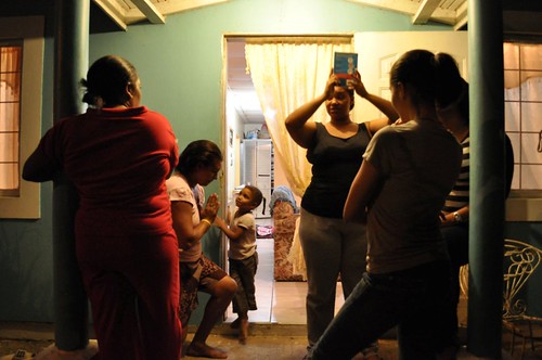
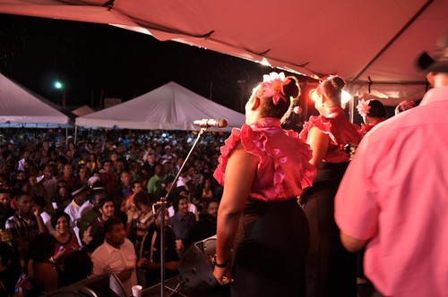
Alice Yard’s final event for 2010 is an exhibition of photographs documenting contemporary parang music in Trinidad, with a performance by the parang group Los Amigos Cantadores.

Isabella Elizalde is a student at Trinity College, Connecticut. She has spent the Fall 2010 semester working in Trinidad under the mentorship of photographer Mark Lyndersay. Her series of photographs titled Unidos por la Musica documents Los Amigos Cantadores over several months leading up to the 2010 Christmas season.
DSC_0316
"I began taking photography classes at the age of 14; I had barely started high school, and had an opportunity to take a photography class. I fell in love with the art instantly; I was astonished at what it had to offer and the by the process of development. In college I took my higher level photography class with Pablo Delano. I learned the struggles and tribulations that a photographer has to overcome in order to create a successful series photographs. I took what professor Delano taught me and brought it overseas to Trinidad.

When I first arrived to Trinidad I did not know anyone, I was nervous and afraid to talk to people since I did not know how they would react to me. Shamagne Bertrand, the program director for my study abroad program, mentioned parang music and the group that she is involved in. I decided to go because I thought it would be a great opportunity to meet people. At first I only went to parang practice to help them with their pronunciation, of Spanish words. However after a while I enjoyed the atmosphere and the people. I was amazed at how welcoming they were to a stranger. I thought that this would be a great chance to highlight what it means to be in a Parang group.

Whenever I went to their practices I felt a sense of closeness and community. Like any music group, there were struggles the parang group had to overcome. They helped each other, and by working as a team, were able to rejoice in their triumphs together. Los Amigos Cantadores welcomed and allowed me to document their daily lives. For me, this made my stay in Trinidad even better. Although at times seeing them interact with each with such love, made me a tad bit homesick, I realized how close the group is.

Every Tuesday and Thursday, the group sets up in the driveway of one of the founding members, Neal Marcano. They fill the streets of Trincity with their wonderful music, the singers singing in Spanish, a language that is practically foreign to them, but sung effortlessly with the traditional instruments of parang in the background. For me, it was amazing and wonderful hearing them sing Spanish songs that my mother used to play for me when I was younger. I truly was immersed in Trinidadian culture in a way I never expected. It is safe to say that without meeting the parang group, I would not have had such a great time in Trinidad. Documenting Los Amigos Cantadores, not only taught me the virtue of community, but also took me on an unforgettable journey in which I was able to find myself through photography. Los Amigos Cantadores welcomed me with open arms and I would like to return the favor and thank them for their kindness, for which I am eternally grateful."
See portfolio here

RUST MUSEUM


For one of my Trinity Program final projects, I chose to create a series of photos referring to my experience in Trinidad to teach someone else about it. I've decided to mount these photos on the rust orange wall as a sort of learning museum for the show. Some of the captions have more of my personality than others, but I tried to keep them objective so they are not relative to my one opinion or experience. This is a timeless museum. ENJOY!


House Project Updates

1. Floor has been stripped and waxed

A huge thanks goes out to our cleaning lady for making the floors beautiful again! It was quite a task that took two days to complete, the kitchen and nook in one day then the entire classroom the next. It was also a task to keep people from walking on the floors for a reasonable amount of time. Of course, I dont want to (and sometimes simply can't) deny users from entering the building... but I tried! As of today, the floors look great. I believe they will get a second coat of polish at the beginning of this coming week. Actually, I wonder if regular floor polish can be used on the wooden stairs too.....

2. Finally got window and door treatments

Thanks to Nikki's willingness and Jude (our driver) for his patience, the classroom and main entrance door now have curtains. I thought it best to look for something light colored and light-weight for the classroom, but grand entrance curtains for the doors. I also found some door beads on sale for the kitchen entrances, in place of thin curtains like were there before. Curtains add a nice touch of home for a place so institutional, but I am no expert.

3. Learning how to make captions on photos


This photo (credits to Nicolette Laume) pasted into Photoshop with great quality and I only need to work on my effiiciency in adding captions now. I'm not sure if I want the text box to appear around the photo, but if I do choose to do that, I'll also put a matching black border around the image itself. Hopefully, I will be able to matte all the images. These are for the rust orange wall, to highlight some features of the program and the country.


The thing is.... I dont want the wall to just be about my experience, but to be mostly universal so it is timeless on the wall. Every generation can view and learn something about what I found in the house, or what we did this semester, etc. So I need to collect photos from other students to compliment my own and make this wall more 'well rounded' and complete. Everyone has exams and final papers and presentations, therefore my requests for .jpgs will be the easiest to forget. I'd rather not sacrifice the quality of the project by waiting. I've already made the group aware that I'm looking for photos, but I havent received any donations yet. I may need a backup plan. I will do my best to give credits where they are due and seek photos for these topics (here are just a few): Pitch Lake, Tobago, Native fruits, Alice Yard, Liliput Theatre, 3 Canal, Leroy Clarke, Maracas Beach, UWI. I may also call upon photos from Andrea's maxi project and Nikki's presenation on boundaries.


4. Official show date


We are required to do a group presentation for Tony Hall's "Festival and Drama" course before the end of the semester. Originally we were to present on May 5th but given the crunch for time with exams and papers, he approved us to move the presentation date to May 12th. Our presentation is going to involve building an installation and live presentation for an audience. With the complexity of my project involving aesthetics, furniture arrangement, and aura, I dont feel that it's a good idea to have the hous opening on the 12th anymore and have been contemplating the 11th or the 13th, but no later or earlier. I'm aiming for the 11th) Of course, I will still be participating in the Alice Yard exhibition on the 12th with Nikki and Andrea to have all of our projects at one moment in time. I want to do an installation to represent the interior design process, but we'll see how it happens as time cruntches.

Adventure Update

In late April, the group had an opportunity to spend the day with Leroy Clarke at his homes/studios in Port of Spain and Aripo. I was very inspired by our encounter with him and the amazing interior creativity in his living spaces (which also act as museums). Click the image above to view photos of this majestic adventure...

Red Band Maxi: A Reflection


Red Band Maxi: The Multimedia component of the installation.

My event went fairly smoothly on Monday. I had an unfortunate hiccup when I tried to have my photographs re-printed in St. James due to an unwilling and unknowledgeable supervisor who made the entire process hell, but eventually, I got the prints I needed and scurried over to Alice Yard to set up. Sean Leonard met me there to set up the projector, and shortly after I arrived, Shannon, my maxi driver, arrived with my mobile "gallery." It was a very tight squeeze but Shannon masterfully backed his maxi into Alice Yard the way I had envisioned. With the help of my mother, father, and brother (who all flew in to visit and to see this event), I began mounting my photographs inside the Maxi while Sean found a mixing board andsub woofer for the sound of my video component. Turns out, the Maxi had fewer rows of seats than I originally thought, so I had some extra prints. I ended up putting one print of an interesting ceiling on the ceiling, a print of the inside of this maxi in the rear of this maxi, and put a few prints around the outside of the maxi.

The general feel though, I think, was still achieved, as people had to move about within and around the maxi to view all the photographs. I was also pleased with how the space formed around my piece. Once you walked up the Alice Yard driveway, you were met head-on with this big Maxi and you had to walk around it to get through the space.

If you walked to the right of the Maxi, you would immediately see the projected video on the far wall of the white box. I liked that you couldn't look at the Maxi without hearing the audio of the video, nor could you watch the video without spatially orienting yourself around the Maxi.
I was, however, disappointed that none of my Maxi drivers showed up. A lot of them had told me that they were going to try to come, but that it would be difficult because their attendance would involve skipping out on several hours of work, and many of them simply can't afford to do so. Regardless, I think the event was successful. At the end of the day, I think everyone did end up leaving there with a different perspective of the Maxis -- and hopefully, a greater appreciation for them, as well.

I've posted the images that I printed, as well as photographs of the set-up and the event itself on Flickr. Many of the images of the installation are courtesy of my multi-talented brother, Matthew Wise.

I really enjoy the images my brother produced. I find that in the flattened 2-Dimensional photo representation of the 3-Dimensional world, the 2-D photographs almost become 3-D and create a visual window into another world, as if there are several realities occurring simultaneously within the Maxi at my event.

Security: A Show at Alice Yard


I will be showing a combination of photographs and stop motion videos, constructing my own ongoing relationship and thoughts about security and boundaries in both it's physical manifestations, and social manifestations.


The show will be held at Alice Yard, at 6:30pm on the 12th of May.


Drawing the Lines


I’ve been working on creating interior image outlines from real photos through Illustrator. It amazes me how time consuming graphic work can be when trying to be accurate. These drawings have been helpful in deciding color choices for the space, but also in giving me practice in this line of design work because interior designers and architects must spend a lot of time drawing and making models before actually altering the space. The hardest part is being both the designer and the main laborer. I don’t want to get too theoretical/ideal in my designs because I can only do so much manual labor between classes, but I also don’t want to jump into physical decisions before taking time to analyze my reasoning. It’s not easy, but I am not giving up on this project. It is something I feel needs to be done. So a huge thanks to Nathaniel for continuing to work with me and be patient as I learn how to use these programs. The above images are still in process, but looking good, if I may say so.


While painting the staircase the other day, the program director expressed her concerns with my finishing the painting portion in time for the show. She mentioned that the program hires a ‘painting crew’ (one guy and maybe a friend) to paint the building interior. I had no idea a ‘painting crew’ was even an option! Now, I suppose I could blame myself for not asking the right questions, but for some reason she got the impression that I needed to do the work on my own because it’s a project… as if hiring a painting crew would be cheating. Having a crew would actually have been a great investment a few weeks ago because painting large rooms with tall walls was very strenuous and time consuming. The painting portion would have been done long ago! Now, please excuse my rant because I am not looking to place blame anywhere. Contrarily, I enjoy painting interiors- it has just been a struggle on time management and physical exhaustion (especially because I dance twice a week and we are in overtime to prepare for the show in Queen’s Hall on May 21-23). So by time the crew arrived on Friday, I already painted the bottom half of the classroom, most of the poles, and the bars on the windows. In addition, I’ve finished the main entrance doors, painted some tables, and scoped out curtain prices from a local discount store. (Photo below is courtesy of Nathaniel Chambers)

Next on my “To Do List” is to curate the accent wall which we call “rust orange.” For one of the Trinity program courses, the final project is to create something that will teach someone else about our individual experience in Trinidad. So I’m thinking to do photos with captions of various people, places, and objects I’ve become accustom to- then give them all matching frames. I also want to include the pieces of costume, dabla, and other object findings from the house for the wall and give those captions too. It shall be a museum wall for discoveries and learning.

Inspiration for arranging things on the wall and when I curate the physical space will be drawn from experiences at Alice Yard, in helping with set up for the “Proximities” exhibit. The exhibit showcased artist work regarding personal space, gender discussions, and family influence on how they view identity. The videos were shown on various nights and projected onto various surfaces for presentation. It was interesting to watch the process of presenting projections in a yard space. Where will the best angle be? What material can it be projected on? Can the videos be viewed at the same time? Should the people in the video be life-sized or larger-than-life? How much volume is too much sound? What view of the Yard can be seen from the street? How close do we want people to get to the screen and what is the impact of proximity on the viewer? So many questions and only one way to find out: trial and error. It was a long night. Yet, the Alice Yard exhibit was a success.

On another note, I bought a two gallon bucket of Off White paint because I thought the crew was also going to paint the upstairs hallway and office and balcony, but more labor means more cost so that did not happen. I tried to return the paint on Saturday around 3pm because I can always use the money for something else, but apparently the shop closed at 1pm. I truly believe everything happens for a reason and now that the first floor is completed I have some time to consider painting the upstairs hallway and parts of the balcony railing. I really wish I could do something about the flooring up there (like repaint that too) but I have to draw the labor line somewhere soon.

Epiphanies and Explanations


A late night epiphany, and followed later by more conclusive research has led to my conclusion about the final presentation of my works.

I will be showing prints of my favorite “Security” photographs, that I’ve taken during my time here in Trinidad. I’m hoping to measure the new iron doors to the building at the end of the driveway in Alice Yard, and see if it’s construction, purposely designed as a display area, will work with my prints. This to me, is the most suitable area to show my photographs, as the structure itself is both a door and a gate, and is meant to keep people out of an area as much as it is meant to lead people into an area,

and perhaps display artwork the entire time! I’m going to experiment with having it open, though this picture here shows it shut.

If Jeanika still intends to use the loft space of that building to show case some of her work, and if Andrea would be willing to use the downstairs area of that building, than posting my photographs on the outside would lend a continuity to my display when I use the white box for projection, as the gate/door/display is in the same line of sight, but can also be used to lead viewers to the other two artists’ works.

Now, I’ve been concerned lately that the only portion of my work that this interesting to anyone is this experimental performance/project. I’m not particularly pleased that the only thing people know about my efforts this semester is that I plan to get naked. It’s a little disheartening to realize that the interests and efforts that I’ve put in before hesitantly announcing this other idea are completely ignored, but it’s unfortunately not something I can control. For this reason, I like the idea of prominently displaying my photographs on that gate/door/display area, as it would be an arresting sight, and the first thing that people would see as they walk into the space.

But I can’t devote all my time and energies to those photographs, since I’ve also committed to this performance/project. I am going to project the stop motion videos simultaneously, on different walls

in the white box. Initially, I was concerned that overlapping beams of lights from the projects would skew the image on the walls. While this would be an interesting effect to play with, I’m more invested in projecting three videos at the same time. I like the idea of playing with the concept that a photograph is a specific, single record of a moment in time. I would be bending and playing with this in a way, by projecting three moving images of the same moment.

If I can utilize an artist here, and incorporate external flash, I’d like to figure out the timing in each video so that each flash is projected at the same time, whiting out the space, and then editing the videos so that the three perspectives shift after the white out. This will involve some complications for me, seeing as how my knowledge of iMovie or another other movie making software is rather limited. I do however, think that I can make this work, and am I’m really looking forward to trying!

Rummaging through fabric and prying the lids of some paint buckets has also been fruitful, in light of this performance/project.

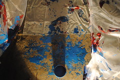
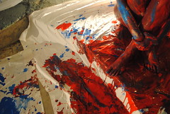
I found red, blue and white body paint in the Program House, which, miraculously, are the colors (well, red and blue) that I wanted to work with in the first conceptualization of this performance/project. There is a little more red paint than blue, so I’m thinking of mixing the white and blue for a lighter hue of blue. This works out well, since a big portion of what interests me in regards to the paint is the mixing that will happen on my body and on the fabric.

The fabrics that I found pose some interesting possibilities. I’ve found a lot of an extremely sheer, slightly shiny fabric, cotton sheets, and a mesh, which is similar to the fabric that basketball/athletic shorts are made of. Tomorrow I plan to test the paint on a small sample of each fabric, and to see how layering might effect the look I’m trying to achieve.

This performance/project will be set up in the space that is shown in the following photograph. I will be suspending the sheer cloth to the upper trellis, above the driveway, as a sort of “ceiling,” and will be creating “walls” with the remaining fabrics.


I’m looking to create a visually stunning tunnel of white, which will taper off in size as it approaches the door/gate/display area that I spoke of previously.

I will be sure to document these steps visually tomorrow, as I attempt to realize what so far, has only existed in my mind! Look for those updates Monday.

Four days to go

It's officially crunch time.

I had my last shoot at the stand in Arima earlier this week. I needed to get those general establishing shots as well as a few specific shots for the opening sequence of the video. Those images have been added to my flickr set.

Update on Multimedia:

My audio track is finally finished. I shouldn't be surprised, but it look me about twice as long as the audio track for the Gina Maingot Essay took. This time, I've worked with layering multiple sounds at a time, so it's an overall much more complicated piece than the last one. I had to layer (and blend as best as possible) tracks from interviews with about 7 different drivers (all outside with differently sounding ambient noises of engines and so forth), a general ambient track for some auditory continuity throughout (a plain engine running), my own voice, as well as different specific sounds associated with Maxis. Structurally, it's just about the way I explained in my last post, although I modified the plan a bit each time I thought I was "finished" to make it flow more. I would post a link to the track here, but I think it'll be more fun to wait to post it until I've layered my images on top. In it's place, here are a few screen shots of the working process in Audacity.
This is about the first third of the track. Each short clip is a separate sound clip, so the track plays from left to right, piling each clip on top of one another at the appropriate time. You adjust the volume level that each clip is played relative to one another by adjusting the amplitude (height) of the clip. So, for example, the clip fourth from the top starts relatively loud, then fades to be much quieter for a while, gets louder at a few points, then stays almost inaudible for the rest of the duration of the track, except for near the very end. I've actually had quite a bit of fun getting acquainted with Audacity this semester. It's a lot more user-friendly than I was expected, and it is very powerful in its capabilities, especially for a free program.
Now I'm on the step of finishing processing and re-sizing all of my images for soundslides and then importing them into soundslides. Then I'll just have to adjust the timing and transitions of each image as it relates to the soundtrack, and I'll be done! Here's another screenshot of that process.


Here, the timing of the mp3 audio track that I just imported is noted towards the bottom of the track. There are thumbnails of all the photos that have been imported so far, in the order that they appear, in the body of the screen. At the bottom, you can drag the image markers to determine when each slide appears and when it switches to the next slide (there are other, more precise ways to do this, by going into the "Slide Info" tab but this way works, too). Transitions and slide movement are controlled in the "Movement" subsection within the "Slide Info" tab.

Printed photographs:

I made my selection of 18 photographs to print for the show, re-sized them all for 8"x12" and walked over to a newly opened photo printing place a few blocks from our apartments with a thumb drive and a Linx card. Unfortunately, the test print was the worst looking photo print I've ever seen. The sky was an artificial hypersaturated crayon blue, the entire imagine was low resolution, the reds tended towards an orange hue, the image itself was warped (the white border around the image -- since they had to print on larger paper and then cut down) was even at the bottom but uneven on the top edge, and worst of all, the printer left physically scratched in track marks across the entire photograph on several areas of the image. They were, however, friendly enough to not charge me for that test print when I ran out of that place as fast as I could. I've found another printing place, though, and will be heading over there tomorrow morning before my weekly meeting with Mark Lyndersay. I spoke to the folks at Photo World in St. James, this afternoon, and they'll be able to print my 18 photographs at 8"x12" in time for me to pick them up after I meet with Mark.

So that's where I'm at. I'm trying to finish my "first draft" of the final multimedia piece tonight so I can hear Mark Lyndersay's feedback on it at tomorrow's meeting and then still have time this weekend for revisions, but realistically, it's probably going to take me another day to finish it.

2 Locks to 6 Locks and lots of learning in the meantime!

"6 Locks" Still

In preparation for documenting my upcoming performance/project experiment, with the goal of creating a stop motion video with stills taken from that night, I've been practicing.

I'm slowly teaching myself how to use iMovie for this project.
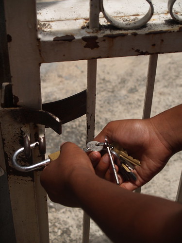
As I posted last time, the first stop motion video that I made is called 2 Locks, and is a quick documentation of how I get in and out of my apartment.

This time, I've gone a little bit further, and included Jeanika in my experimenting! Together, we documented the arduous task of going from inside her apartment, to the Program House, where she is working on the interior space. That's through six locks people.

So behold, 6 Locks.

I have increased the time of each frame, from 0:03 seconds each in 2 Locks, to 0:05 seconds in 6 Locks. There is a discernible difference in my opinion, but it is still fast enough to really feel the movements.

Right now, the process is not overly complicated. Thank you Apple, for streamlining your programs! Uploading photos into iPhoto allows for easy access by roll in iMovie. Adding photographs to a movie project is done by clicking on "Media" and then selecting the stills by roll. So far, I've been able to add each roll, which places them in chronological order by title. The most editing that I have done to each movie is deleting a few stills that are too repetitive, or pieces that are too distracting. For example, while Jeanika is crossing the street, she paused, and a large black truck hurtled by, showing up significantly in just one frame. This was a large distracting black flash in the final product, so I deleted the frame. I've also been playing around with the duration of each image, seeing whether or not I liked to focus on each lock for example, by keeping one frame, or a build up to the lock frame, slightly longer than the others. It didn't look right, and ruined the continuity of the motion, so I left well enough alone, and so far each frame is shown for an equal amount of time, with the exception of one frame in "6 Locks." In "6 Locks," the last frame is held for twice as long as the rest.

Unfortunately, one of the issues that I'm having currently, in posting videos to Youtube, is that it cuts out the last five frames or so, essentially deleting the closing shots that I took. This is annoying, and I am hoping to upload the videos to Flickr (I had forgotten that a Pro account allows for video uploading until I uploaded the stills in this post!) and see if that hosting site allows for the full video.

The videos uploaded to Flickr are: "2 Locks" and "6 Locks" (Flickr shows the whole video! See the last few shots at the end of each one on Flickr!)

The quality of the posted videos is another kink I have to work through. I learned how to convert iMovie projects into QuickTime compatible files via this youtube video, and following these directions leads to a small viewing size, which pixelates and distorts with any magnification. However, when I attempted to leave the quality as I view it on my screen, youtube kindly informed me that it would take around 8,945 minutes (give or take) to upload. I quickly cancelled that for the sake of time and the browser speed of the rest of my Safari tabs, and uploaded the smaller version instead.

I've also been contacting the various artists and friends that I've met (and some I haven't met!) since coming to Trinidad to ask (beg?) for help in one part of my final project. It's this performance/project. I'm inexperienced with a number of aspects of this project, so I'm enlisting in all the help I can get! I've gotten kind words already, lots of help from Sean Leonard who has kindly scheduled me into the space for some of this coming Saturday, and all of this coming Sunday.

On my agenda yet is fabric shopping or scavenging, and paint evaluation and potentially shopping. In Jeanika's explorations of the program house, she found around 6 half gallon containers of the body paint that I was planning on using. While they are not the colors I had in mind (black and white), I'm willing to use red and blue in order to save money. However, I haven't checked on the quality and quantity left over yet, and am hoping to find full pristine paint, rather than dried out dredges! Additionally, she had found a large amount of fabric, and I'm hoping that a second go-through will yield some extra white sheets!

"6 Locks" Still

That's all for now, but I'm very happy with the progress that I'm making!

The Classroom. Our House. My Home.

For our Program House class sessions with Tony Hall, I thought it would be interesting to rearrange the tables into a different layout. Usually the tables can be found in the middle of the room next to each other (by short side) or put away and we sit in a circle with chairs. For me, it’s a struggle to write in my notebook while it’s on my lap so most of us don’t take notes at all. So I started to experiment layouts with the available furniture.

Intervention 0: Following an evening social event, the couches were already arranged in a living room style, facing the television. The long couch acted as a room divider and was backed by a long fold-out table with a few chairs near to the entrance. I wondered what class would be like in an informal living room setting and contemplated moving the couches to face the blank wall with the white board rather than the television set. I was given permission from the directors to leave the setup for the Wednesday class, but Tony Hall disagreed and removed the tables completely, fixing the sturdy blue chairs in the usual large circle. Two program students later mentioned that the couch setting would have been too comfortable anyway and they wouldn’t have been able to concentrate on the lecture. This prompted the question: What is more important, comfort or effectiveness? Should a classroom have a balance of both? Is this factor decided by the user or the environment?

[The image above was made in Illustrator. It took the time and patience of my friend Nathaniel, a Trinidadian graphic design student, to teach me how to use the program to this extent. I will also be experiementing in photoshop and learning the uses of Picasa to complete this project.]

Intervention 1: So for the next session, I put the tables together by long sides to form a square in the typical college “round table” discussion style. This would allow us a surface to write on, equal view of the professor and the white board, and the ability to communicate more effectively with each other. There are plenty of windows to light the setting and enough table space and chairs to accommodate the group. It look much more like classrooms we were used to at home and I thought it would lead to more intellectual and intimate discussion. The couch was turned away from the classroom to act as a room divider again, but made it seem like the entrance came into a living room.

What actually happened during the class struck as powerful and unusual.

This class was the first time Tony Hall used the physicality of the classroom layout to transition into a topic for class discussion, which happened to be about the oppressed, the oppressor, emancipation from mental slavery, and cultural mind sets. In other words, this more institutional setting changed Tony’s class lesson approach to one more strained, trapped, and defensive. It was as if the arrangement was equivalent to some type of human bondage- which I was definitely not expecting. He noted that the setting was good for a university class where debate is preferred, but not for his course in Trinidad, where the object is creativity rather than attacking ideas and defending mindset positions… or at least, that’s what I understood from the high-powered class. I’ve never seen participants become so vulnerable or hear voices rise in dual argument or felt such sarcasm tension the conversation. I never knew a table arrangement could do that to such a group of intellectuals and learners. I ended up staying very objective from the arguments, simply taking in the mood of the moment and questioning my role in the tension. Who was to blame for the outcome? Why did this setting impact the student-professor relationship so strongly?

Intervention 2: The following week I thought it best to find a hybrid of the two configurations, to give equal view to each other and keep the focus on the professor. I did not like how the “college setting” affected the mindsets of everyone in the class and I suppose it makes sense why the clearly institutional setting was unsuccessful in our multi-use house anyway. The classroom cannot be informal or too serious. So the tables took on an “L” shape facing the blank wall. I pushed the long couch closer to the entrance to give more space for movement, but kept it as a room divider, backing the class. The smallest couch (one person) joined the blank wall as a focal point and the large table for the professor was replaced with the smaller one from the kitchen to prop the white board against, but not take up as much space. Can I create a classroom to please everyone?

When Tony Hall arrived, he looked at the formation and unassembled the tables himself. Of course, I quickly snatched up my notebook and began to ask him questions about this decision. “What is wrong with this formation?” “Why do tables make you feel trapped or constrained in the space?” “Why did the ‘college-style arrangement’ change your lecture approach?” His response was not what I expected to hear and yet…I was not surprised either. He explained that the configuration changes the lesson because of how people are forced to be in a space. Having the tables in a square encourages opinionated conversation and people play minds games because o vulnerability. In class, students are supposed to experience and consider thought while in the space, not attack me for the statements I am suggesting. I would prefer not to talk at all. So the only way to create a different mindset this week is to completely change the setup because there are politics about the self we can’t even comprehend, especially not in an institutional setting. It was a lot to take in.

So when class began he sat in the small couch, palms down on the armrests, and takes a few minutes to gather his thoughts about what to do next. He asks us to take time to breathe and create “create space within the silence”. That was an interesting notion to contemplate. Then we suggested words and phrases which were inspired by our journeys in Trinidad. Words like “heritage,” “music,” “boundaries,” and “change.” Later we learned that the activity for the class session was to find a space within the house to create something… anything… related to or inspired by the words suggested before. (Given that the house is in a state of ‘remodeling,’ I was thrilled to see how people were going to use the space) Some students made posters, some created costumes for themselves from things found, Andrea taped off a doorway, posting phrases to answer the question “What would you do if the world was going to end tomorrow?” and I created a journey about learning throughout life by using dishes and found objects (locks, screws, money, chains, utensils, etc) along the countertop. Nikki made a paper blindfold with ear covers to continue on the notion of creating your own silence within the space. It then occurred to me how much deeper versatility of the space is to the objects in it. It’s not just about the tables and couches. It’s not just about the wall colors and fabric textures. It’s about individual connection between the all-encompassing idea of the ‘House’ itself and the generations of users.

How can I make this House timeless? How can I make this House a home for everyone and is it possible to do that? Where does “home” begin and end? Where does my part stop?

Clarke, Experimenting and 2 Locks


Leroy Clary has created a home to display his works, and in that endeavor, an interesting combination of conventional and artistic exhibition. I was able to witness this during a trip to both his house/museum in St. Ann, and in his studio/home spaces in Aripo. With this experience in the back of my mind, I turned to Boris Groys’ “Politics of Installation.”

Groys insists that “the installation transforms the empty, neutral, public space into an individual artwork—and it invites the visitor to experience this space as the holistic, totalizing space of an artwork. Anything included in such a space becomes a part of the artwork simply because it is placed inside this space.” Furthermore, “what becomes crucial is the distinction between a marked, installation space and unmarked, public space.”

However, previously, Groys also states that “the only function of such a [public] space is to make the art objects that are placed within it easily accessible to the gaze of the visitors.”

In this way, Clarke’s house, with the ambiguity of private and public, yet acutely contrived as an exhibition space with an emphasis on a workable living arrangement was unlike anything I have ever witnessed, as it combined Groys’ two concepts.

And I found it unnerving. How could one live within a tribute to one’s life’s works? Does doing that fatalistically determine the end of a career? Is it a certain type of pragmatism that allows for an artist to collect and create their own masterful tribute to their life’s dream?

These thoughts, and more around my own artwork, claimed my weekend.


In Groys’ work, I also made reference to my own body of work around the concept of “security.” Groys states that “art’s function is… to make visible the realities that are generally overlooked.” This reason, beyond my own convictions surrounding freedom and security substantiated my near obsessive concentration around boundaries, borders and security, and their physical manifestations of locks, gates, walls, shrubbery, windows and doors, gives more substance to my experimentations planned for this weekend.

As previously discussed, I am going far and beyond my own areas of passable expertise to create an experimental performance/project based on my thoughts surrounding my introspection around security. As the days draw nearer, I am reaching out to some artists that are currently working in Trinidad for some semblance of guidance and transference of advice. However, most of my invitations to these artists have been after weeks of no contact following a single meeting, or out of the blue with a quick mention of my connection to Christopher Cozier.

Due to this, and my relative inexperience, I don’t know what to expect of my experience for this performance/project. I still need to purchase fabric, though I think I’ve procured enough paint via the scavenging of Jeankia’s Program House Project.

What I don’t have is the upmost confidence in my ‘vision,’ which I am not currently viewing as destructive, but rather as constructive. If I don’t have a very clear idea of my end results, I can’t go wrong!

What I’m hoping to get is a rudimentary portrayal of my feelings surrounding security, and great big learning experience!

The final showing will be on May 12th at Alice Yard, in Woodbrook. Come one, come all.

And before then, help this neophyte out in any way you can imagine! Maybe, you’d like to help by providing insight to iMovie. I’ve created my first, very simple video on iMovie, called 2 Locks, which I’ve posted HERE. I’ve got the (VERY) basic skills to make the video! Now it’s a matter of (time permitting) practice and dedication, and YOU!

T minus 8 days


So, my maxi exhibit/installation is in eight days. This is the homestretch and the final scramble to get everything together in time.

Multimedia piece:

I went over the soundtrack I had with Mark Lyndersay this past Friday. He helped me sort of group the components of my story in a more logical way, and helped guide me towards a re-organization of those components so that my multimedia will follow cogent narrative. This, however, has required a complete reworking of the soundtrack I had. I've been working on it all weekend and it's almost finished. The story should run as follows:

1. Introduction: Maxi Driver 1 talking about how there's so much you can find if you look into the Maxi Taxis. Establishing shots of Maxis and Drivers. Introduce maxi stand in Arima with Maxi Driver 2 joking about how this (Arima Stand) is the "original stand" and all others are "counterfeit. Establishing shots of Arima Maxi stand.
2. Identity: Maxi Drivers telling about how their Maxi names reflect elements of their identity (spirituality, etc.) accompanied by visuals of the vehicles and their drivers.
3. Details: My own narration of noticing various interesting details in different Maxis accompanied by those detail shots.
4. Conclusion: Maxi Driver 1 (from Introduction) talking about how the Maxis are one of the few reliable things in Trinidad accompanied by shots of Maxi stand during rush hour (people entering, exiting..)

In mapping out the flow of my story, as anticipated, I have found some holes in my image set. First of all, I need more broad establishing shots of the Maxi stand in Arima. I need to give the viewer a visual sense of where this story fits into the community before I place them inside the story with shots of specific vehicles and drivers. I also need to try to find some of the specific maxis that will be featured in the "Identity" section to shoot more. In order to avoid confusing the viewer, I need to present each maxi in the same way (ex. Wide shot of entire Maxi, followed by close up of the name, followed by image of maxi with driver). However I chose to go about that, I need to be consistent so I don't confuse my viewer. Lastly, I need pictures of the stand during rush hour! I've been purposefully shooting during off-peak hours so that I can catch my drivers when they have time to talk to me, but I need to have visuals to depict the reality of the crazy busy madness that the daily morning and afternoon commute entails for these guys.

Logistics for the exhibit:

I have lighting covered with the battery powered stick-on LED lights I purchased in Florida. Now what's left is to figure out how to project the multimedia (and where) and how to play the audio track. I know that Alice Yard has a projector and speakers, but I need to make sure I talk to Christopher Cozier and Sean Leonard tomorrow to be sure that they'll be available for my exhibit. I think it'll make sense to just project the multimedia piece into the white wall of the small gallery space at Alice Yard, while the Maxi (with photographs mounted on the backs of the seats) stands imposingly in the rest of the yard space. This way, when you walk into Alice Yard, you're immediately faced with this Maxi in your way (which achieves the effect I'm looking for, of forcing people to acknowledge and interact with the Maxi), but the entire space will also be filled with the audio track of the multimedia piece. Since the multimedia is really serving as an accompaniment and an explanation of the images, I'll be alright for that to run visually somewhat separately from the Maxi itself. Other than that, I just need to call my Maxi Driver, Shannon, next week to triple check that he's coming and bringing his vehicle with him.

As I said last time, there's still so much work, but each time I post on here, I see it all coming together more fully.

Oh! I almost forgot! This past weekend, we were fortunately enough to meet with the incredible artist, Leroy Clarke at his home/personal museum/studio spaces in St. Ann's and in Aripo. Turns out, he knows Mark Lyndersay's work, so I told him that Mark Lyndersay has also been mentoring me this semester in my photography project. I told him about the exhibit and he asked me to call him to remind him to come! It'd be really really cool if he can make it, especially in adding to the diversity of the more-art-inclined/less-art-inclined crowd at my event.

The Soucouyant: Presentation of Movement and Embodiment

Last Thursday I participated in a friend’s mas costume presentation for her class (photo courtesy of Joseph Bertrand). It was not something I could really prepare for but I showed up and continued to be surprised that day. Her costume was in honor of “Soucouyant” (pronounced: soo-coo-yah),a fire woman from folklore. After doing some research, I learned that the Caribbean character is actually an old woman by day [Apparently, she can be in other animal forms too] but a skinless fireball by night. She gets into homes via cracks or holes and sucks the blood from humans, taking on the skin of her victim if killed. If salt is thrown on her forgotten skins then she will be destroyed upon trying to re-enter it. There are some written accounts of people encountering the fireball woman, but it is generally known as a Caribbean legend, which is still told in Trinidad.

So the costume I wore for the presentation focused on a grand headpiece to illustrate the character. This included a set of chief feathers, round cage with cardboard flame drawings attached, and was topped with blinking devil horns. The chief-like Mohawk of feathers represented the personality of this specific version to be a warrior. Besides the sports bra and spandex shorts, I had some black paint smeared on my body, and heavy costume makeup on my face. The makeup seemed to resemble a mask, raising my eyebrows an inch above and enlarging my lips. The makeup was a great addition to the headpiece, and I think made all the difference in how my face was to be received by the audience, and hence the costume's effectiveness.

The most demanding part of my participation was the improvisation of a presentation for the class. Given that her costume involved an intricate headpiece, elaborate costume makeup, and little skin covering, I had to bring the rest of the body to life. Of course I did not know all this research before the performance so I only had her advice to work with. She reminded me to stay low to move fluid, look like I’m mad or want to eat the people in the class, and to hiss while saying “Soucouyant” at various speeds or pitches. She asked if I knew “how to be possessed” on the morning of the performance. So I bent, hissed, crawled, glared, and strutted around the classroom, hoping to give the best portrayal of her costume that she wanted. At that moment of immediate encounter, I had to give myself over to the character... or at least the little understanding of it. I had to actually be angry and really glare and scream at the top of my lungs because there is no such thing as ‘pretending’ in improvisation. I did not do a skit because it was not rehearsed and I did not do a dance, but I would call it a presentation of movement and embodiment.

This must be the definition of “mas” in Trinidad when Carnival was thriving. People take on the character of “mas” or their individual traditional characters so deeply that it becomes a second personality. “Mas” being short for “masquerade” is more profound than just wearing the mask.

The best part was not being allowed to wear my glasses for the presentation (photo courtesy of Andrea L. S. Wise). Not only could I not see the floor (in addition to the cage around my head) but I couldn’t see the people in the classroom to read their facial reactions. This made me very internalized on exaggerating the movements and making the effort to make contact with every figure I could make out. I did not even know that I screamed at the professor until after the class was over! It was a great experience to do something so blindly: without knowledge of the folklore details and without my glasses. It is even more valuable to research and reflect on a cultural aspect I knew nothing about before this experience.

Final Project Ruminations


I’ve been thinking more on my final ideas for a project/performance and showing for the Alice Yard space to showcase my artistic efforts and growth through Christopher Cozier’s and my overall experience of Trinidad.

In our classes, we’ve been discussing the upcoming Proximities (http://aliceyard.blogspot.com/2010/04/proximities.html). One film being shown is Still from Que Te Vaya Bonito (2007), by Ivan Monforte. In speaking about this work, I was fortunate to be part of a discussion pertaining to performance. This is especially important to me, as I intend to have a performance piece attached to my final showing at Alice Yard. However, what caught my attention was the fact that Monforte chooses to call his works “emotional sculpture.” Rather than identifying with performance, I am more and more interrogating this idea.

With a few similarities between intent, I choose to make this intellectual journey. First of all, I’ve never done a “performance” in this way. I don’t dance. While this is no distinction to make, all things considered, it has played into my own ideas of possibilities and securities about the project. I feel, in borrowing the concept of “emotional sculpture” from Monforte, the comfort in purposefully policing the space of my artistic endeavor. I don’t mean to produce pornography, despite being nude. I actually cannot even predict what the final outcome of this experiment will be, but looking at the project through the scope of “emotional sculpture” has helped to alter my self-perceptions and feelings of safety and comfort, which are incredibly related to my subject matter.


I want to create a space to perform or sculpt that is bereft of an initial audience. In this, I do not wish to be catcalled, have a clapping audience, or the feeling that this is all for show, and not true to my feelings and improvisational motives. I haven’t planned a routine, and I can only guess at how the planned photography will actually come together. I don’t even know if I’ll be able to get naked. All of these things, to me, create the possibilities of recording a baser truth to my reactions and movements, partially in line with the concept of “emotional sculpture.”

I want to limit the spectacle of nude dancing by creating, in the photographic stills film, a distance between the viewers that is challenged by my body narrative.

This has been a very intense way for me to approach looking at locks and borders and boundaries, but beyond that, or perhaps through that new viewpoint, I have been able to more thoroughly explore my own bodily boundaries, constructed limitations, and the unique possibilities that my standpoint can present.


Looking Brighter with Buccoo and Bone White

The most recent update is the installation of a new countertop laminate in the kitchen (shown is the old counter during construction). Although it is not the original one I wanted, I am pleased with the quality, color, and price. So thanks to Asia for the labor help, the kitchen is now Buccoo green with cabinets and accents in Bone white. The laminate was the last piece of the installation because half of the wood needed to be replaced due to termite infestation. I love the new, clean look! I think the doorknobs still need to be painted in white to match the counter’s molding and I have begun to organize dishes by sets and color for the open shelves above the counter. Of course, everything takes time and the walls still need a second coat, but things are looking brighter for this room.

Here are some quick chalk pastel drawings I felt inspired to do when trying to balance colors and loosen up about the architectural structure. These are not to scale, of course, but straight from my memory of the spacing and projected color hues. The top image was drawn first and depicts the under-the-staircase nook with kitchen doorway, whereas the lower picture is of the classroom with left exit to the kitchen's second doorway.

Boundaries in the "family" and performance thoughts/anxieties

I recently attended a movie night of documentaries surrounding the lives of LGBT people in the Caribbean. While a discussion of the films should be left to another venue, I do want to discuss the space here, given the amount of time I spent thinking about boundaries while there.

In Trinidad, the LGBT community is necessarily private, which means loads of constructed boundaries to keep sexuality hidden from those outside of the “family.” This was no surprise to me, and frankly is similarly present in many areas of the States, and particularly obvious at Trinity College, at some times. But I digress, as I was hoping to more specifically touch on the physical as it relates to the social. This location, while named on the Facebook invitation, and website and list-serve, has no specific physical location, beyond the street name. I spent a lot of time searching online for the number, and eventually found it in an old internet archive for an event held there. So already I had encountered the discretion of location.

With this in mind, I wasn’t surprised to see that I would not have been able to pick out the building if I hadn’t found the number online. It was a house like any other, only really distinguished by a few people liming out by the gate. So I timidly asked if this is where the movies are showing, and was answered in the affirmative. I walked down the driveway, and rather than going into the house, I passed through a set of two gates, off set so that you had to zigzag in, and also serving to hide the yard from the street. All these boundaries, to hide and protect, and to camouflage the relatively huge yard area from the rest of the world.

And even once inside, it was dark, with only a few little mood lights to light the yard. So the high, off set gates, normal house as a facade, and the unmarked and locked gates really served to physically mark the social aspect that is apparently necessary to create a safe space for a prosecuted social group.

Also this past week, I had a great conversation with Daniella Carrington about my final project, and more specifically, about the performance aspect.

Talking to a stranger about my ideas required me to really explain what was happening in my head, and brought to light a few points that I hadn’t yet articulated about my connections to my idea, and my relationship to locks and boundaries and security.

I’m more cognizant of locks and walls and barred windows and razor wire, partially due to this project, but primarily because I chaff at the thought of being bound and separated, be it physically and literally, or stereotyped into a certain role, sexuality, race or class group.

In talking about nudity and dancing too, I realized part of why I am invested in nakedness for the project. So often, nakedness is used as a boundary and security for exotic dancers and sex workers, and the act of getting naked is an act devoid of any real sense of revealing the self.


I also really connected with Daniella’s idea that sex is closely tied to you as a person. I whole-heartedly agree with this statement, and also find this to be a reason why I’m very much devoted to the sexual aspects of security and boundary, but also why I’m very nervous about sharing that part of myself beyond a sexual partner, on such a large yet still intimate scale in Alice Yard.

In addition, we spoke about the notion that Trinis have a rather schizophrenic view of sex and sexuality. Carnival is a very sexual time, rife with the physical and social aspects of displaying one’s body and sexuality, all in the abandonment of the public scene of bacchanal. It is this idea that also makes me nervous about putting myself out there, both in being naked, and in the script that I have prepared for my still video compilation.

Will the issues that I raise resound at all, if notions of gender and sexuality that I have are not present in this society to the same degree as my socialization? Will my performance read in a way entirely different that I’m trying to present? Will it be too heavy handed? Will the performance aspect connect in the audience’s mind to the photographs of security measures?

With these questions in mind too, I’ve been thinking about how best to create a space in which I can be part of a discussion on my work. I’m not so sure what will be raised, but that is certainly why I’m interested in providing either some sort of discussion, or comment area. Since I’m still working through all of these things myself, I’d be really interested in hearing how other people react!


New layers to the Maxi Taxi story

As I wrote in my last post, the more I talk to Maxi drivers, the more layers I find to this Maxi Taxi story. There's expression of religion, and I've already seen five faiths represented in Maxi names (Judaism, Christianity, Hindhuism, Hare Krishna, and Islam). There are names of Maxis that I assumed were statements of egotism but are actually statements of spirituality (ex. The Great One referring not to the driver, but to God). There are names that have deeply personal meanings to the drivers, and likely little to no meaning to anyone else. There are drivers whose main concern in naming their vehicle is that passengers be able to remember the vehicle so they can retrieve lost items (like a cell phone or keys). There are also drivers who do not name their vehicles because they wish not to be identified. There's concern over job security as the government continues to talk about building a rapid rail train from Port of Spain to Arima, which would run the very route that my drivers run. There's a feeling that the laws, meant at cracking down on some hazards, are stifling the creative expression of drivers.

In fact, I've been learning so much about the dynamic Maxi sub-culture, that I'm not really sure how to pull it all together into a logical narrative. I want to present my exploration of Maxi culture, but I want to present it in a way that flows sensibly, and doesn't feel discombobulated and disorganized. I think the best solution is to try to do another short multimedia narrative, including photographs, audio interviews with drivers, and a third track of my own voice narrating. This was my original idea, but I abandoned it when I thought I wouldn't have enough time to gather my materials. After talking to Mark Lyndersay, however, we agreed that the very process of organizing my captured media for a multimedia narrative will help me organize my thoughts, and ultimately, help me see a sensible way to select and present my still prints. I know that I will have to touch at least on the spiritual expressions, the motivations for naming vehicles, as well as a bit about the current controversy surrounding the rapid rail.

So that's where I am in this process right now. I have about 40 still images that I like so far, some stronger relationships, and interviews with about ten different drivers. I have enough captured raw media to start compiling a multimedia, but I need to really get a move on that. There's not very much time left before my show, and I'm sure that as I work through the multimedia, I'll discover places where I'm missing some element of the story, and I want to have enough time to go out and ask those questions and take those photographs to fill in the gaps.

Other than that, a few technical nitty-gritty details about the final show:

1. Lighting: I was traveling to Florida for the weekend and picked up several LED stick-on push-button lights from Target to light the interior of the Maxi. Since my show will be at night time, I imagine I'll need about one of these lights to stick onto the roof of the vehicle to light the images, and then I got a few larger, softer lights of the same style to stick to the isles of the Maxi. Hopefully, those will work out to provide enough light to view the images.

2. Promotional cards: I started handing out the promo cards that I wrote about in my last post, and so far, they seem to be having the effect I'm looking for. Drivers who I've spoken to before seemed happy to see a little legitimacy to my claims that this is a project that I'll be exhibiting in Port of Spain in May, and drivers that I hadn't met previously seemed more excited about helping me out once I handed them one of the cards. A few guys even asked me for some extras so they could hand them out to their friends. I really just hope that they'll be able to make it.

3. Press: I've spoken to Ms. Sunity Maharaj-Best, a journalist who works closely with our program, who is very well connected to the media in Trinidad and Tobago, and she's going to try to see if some of her friends in the media can come to my show. My thinking is that if a bunch of Maxi drivers show up, the show itself could serve as a good venue for some conversations about the impact of the rapid rail on my friends in the Maxi industry. I think it would make a good human interest story and could encourage decision-makers in Trinidad to consider the impact on the Maxi drivers, which I imagine, they haven't really been thinking about.

My vision for the final showing is starting to clear up, and I'm getting more and more excited to see how it turns out. There's still a ton of work I need to do to prepare, but I think if I manage to pull it all off, it'll be one of the most rewarding photography projects I've done thus far.

My most recent Maxi photographs have been added to my red band maxi photo set on flickr.

Re-Arrangements: Spatial Intervention

There is something really challenging about trying to arrange this Program House space which my mind has yet to comprehend. The house is made of limited rooms and can be such a versatile building depending on the day of the week. So recently I reminded myself that my job is not to stage the furniture where it looks best for the showcase, but to observe furniture functionality within the space and how users interact with it and each other. Whether this means parties, movie nights, formal class, or community cooking, the space needs to remain transformable and secondly, be aesthetically pleasing. In this case, the space itself needs to tell me the story to narrate.

So after speaking with Sean Leonard again last week, I felt encouraged to try experimenting with the furniture placements in the space. What if the couch was in a different place? What if there was a table beneath the stairs? What if the computer changed angles? Where else could this book shelf go? While some would say it smart to make a model of the place or to measure/draw out exact measurements of the dimensions for every corner and inventory objects, I felt it best to just … do it. By Friday night the computer backed the bookshelf, both splitting the room between the nook area and classroom/entrance area, the couches squared around the television in a living room setting, the large pillows from the nook went up to the balcony and all the balcony chairs lined the window by the lower entrance. It was interesting to see the placement in action when we had a mini social event with games on the fold-out tables and chatting happening on the couches (no one even turned in the television). The evening closed with all attendees on the balcony “liming,” falling asleep, and laughing into the night. I look forward to another arrangement surprise this week!

Vander (another program student and very helpful friend) and I also found ourselves wandering a few blocks around the local neighborhood to see what materials are actually available to use. There are several hardware stores for paint, tools, etc, as well as a major furniture store where we found furniture sets, chairs, appliances, rugs, and more. So I have a visual measurement of what I want to happen. I got the painting tools, measuring tape, prices for some cabinet knobs and took note of other small things. While I want this place to gain a more homey feeling, I also know that it is an institutional building with many academic purposes and needs to be functional for years of program participants to come.

In observing how people use the space, and how I wish the building could be used, Nikki also mentioned that I should try to photograph people using the space in various ways. It would be interesting to note how its uses change with the day of the week or if my physical arrangement impacts how it is used. I’ve even gotten permission to leave the ‘living room’ couch set up for class on Wednesday, so we’ll see how the arrangement changes the classroom environment and group dynamics.

Last Friday I also got to meet the ‘cleaning lady’ and volunteered my afternoon to help her out. From the fridge, to the found shelves, to patio chairs, and moping, we cleaned everything in sight. She had some great ideas on how to improve the space too and mentioned how she has seen it used in the past. I look forward to helping her again this week and with the floor-waxing process in May. Would my alterations to the house change her duties? Even though we are the ones to use the house, whose responsibility is it really to take care of the place?