On February 17th, I posted a Question of Color, in which I reflected upon some of the challenges to making decisions about whether or not to work in color or black and white, especially when the decision is left to be made after the shoot, as it is with digital photography.
This question arose again when I was post-processing my images from the Blue Devils in Paramin, Maraval on Carnival Monday. A big part of the Blue Devils character is, obviously, their blue color, so black and white images would leave out that element. On the other hand, some of the same problems with color came up with these images, in particular the question of whether or not the blue paint was visually distracting from other content within the images, like the facial expressions of the devils or the on-lookers. Another factor for consideration was the night's poor lighting, the Devil's rapid movements, and my lack of a quality external flash. As a result, some of the images, which I find to be of a nice moment, look really crappy, but a black and white conversion diminishes the visual impact of the technical deficiencies. An example of such is the image below, of a Devil attempting to scare a nonchalant onlooker, and failing. I find her body language, the way she cooly drags from her cigarette and cocks her head to the side while maintaining eye contact with the masked devil to very sexy, an unexpected feeling given context of the Devil's activities. It's a nice moment, but it was dark, there were no street lights, and the only flash I have is my camera's built-in flash. The result is lighting that is too harsh and lacks atmosphere (see below).

When I was working on these images, I was trying to decide whether to publish them in color or in black and white, but instead, I chose to do both. My final image set consists of 6 color images and 5 black and white images. Although photographers usually stick to either all color or exclusively black and white in a single presentation, I've seen a few photographers successfully employ a mixture of color and black and white in their work. One of my favorite examples is Matt and Melissa Eich's multimedia presentation, Love in the First Person, published by MediaStorm.

Although the story is told predominately in color, there are two black and white images within the first 60 seconds. The piece also incorporates black and white video. Overall, it's a practically flawless piece of multimedia storytelling and I think part of its strength is its selective use of black and white images to evoke a different feel.
I suppose the real question is why you chose to present an image in color or black and white. With most artistic decisions, there should be some thought involved in it, and technical deficits probably don't constitute a good enough reason. Regardless, click here to see my image set from the Paramin Blue Devils and to decide for yourself if I made the right decision or if the color/black and white combination is just awkward.

For fourteen years, Scott Strazzante followed, and photographed, two families, the Cagwins and the Grabenhofers, as the Cagwin's farm home is demolished and the Grabenhofers move into the housing development that takes its place. The seven and a half minute long piece compares life for the two families, but its the presentation of the ideas that tells the story so convincingly. The piece is filled with carefully selected images presented side by side, a shot of the Cagwins next to one of the Grabenhofers, and although throughout the piece, the moments depicted of the Cagwins all take place years before the Grabenhofers' home was even built, the side by side image presentation conveys Strazzante's idea of Common Ground so perfectly, and so beautifully. Strazzante's conscious decisions about what form to use to most effectively tell the story is not only limited to his selection and pairing of images. There is a very compelling sequence at 1:43 in which the Grabenhofer father is teaching his son how to ride a bike, and part of what makes the sequence so compelling is Strazzante's use of stop motion animation instead of video. The still images, presented rapidly in sequence to give a jagged, uneven, video-like effect is so much more effective than the same moments would have been with video. In this case, the stop motion animation mirrors the son's unsteadiness on his bike, and emphasizes that all of life is just made up of individual moments, like individual still photographs. In the words of the famous Henri Cartier-Bresson, "Life is once, forever".


 Last week we attended the Preliminary show for King and Queen adult
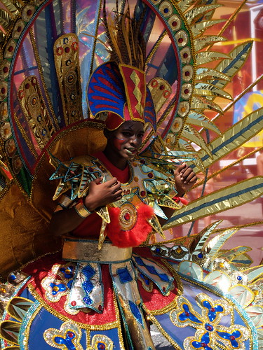
  I feel very privileged to have had the opportunity to be at stage front taking photos with the various media crews. I also found that my role at stage front involved more than just taking photos, and discretely dancing to my favorite tunes. Some contestants needed moral support. At moments where a person looked nervous, they looked at me bobbing in the front and remembered to smile. At another time, the tribal mask fell off one guy’s costume, making him unfocused. All I could do was to nod my head and smile, as if to say ‘it’s ok, the show must go on,’ because I know that the performer never picks up a malfunctioned prop while in the moment, they have to work it into the show somehow. Then after pacing the stage a few laps he wheeled back over the mask to pick it up and held it near his face while grinning at me, as though he won a grand prize or found an old friend. I gladly photographed his triumphant moment and suddenly felt like I was meant to be there at their feet, beneath the stage, between the lights and audience.
 It has been an interesting task to not only manually create the costumes by painting or stapling or gluing, but to document the creation process step-by-step and then showcase to judges. The designer even explained her theme idea to me and showed original sketches of the various costumes. Given that my purpose for attending the children’s masquerade was to chaperone the
  I was also really impressed by the children’s costumes, which were suited for ages 12-15 girls and boys. The designs, materials, and themes, were very sophisticated and festive. Even the size of the costume did not halt the participants from prancing around the stage with smiles, making the costume show a real performance. They were also judged on ability to portray the character. Theme varied from traditional characters or attire to dragons, the rainforest, and even makeshift pirate ships! I was also pleased to see that there was a lot of good sportsmanship present between the contestants as winners for various categories and placements were announced. Parents were supportive on and off stage, adding to this feeling of celebration and togetherness. In the end, I really enjoyed my experience in the Savannah of Port of Spain, Trinidad, encountering both visual arts and performance at the same time.


